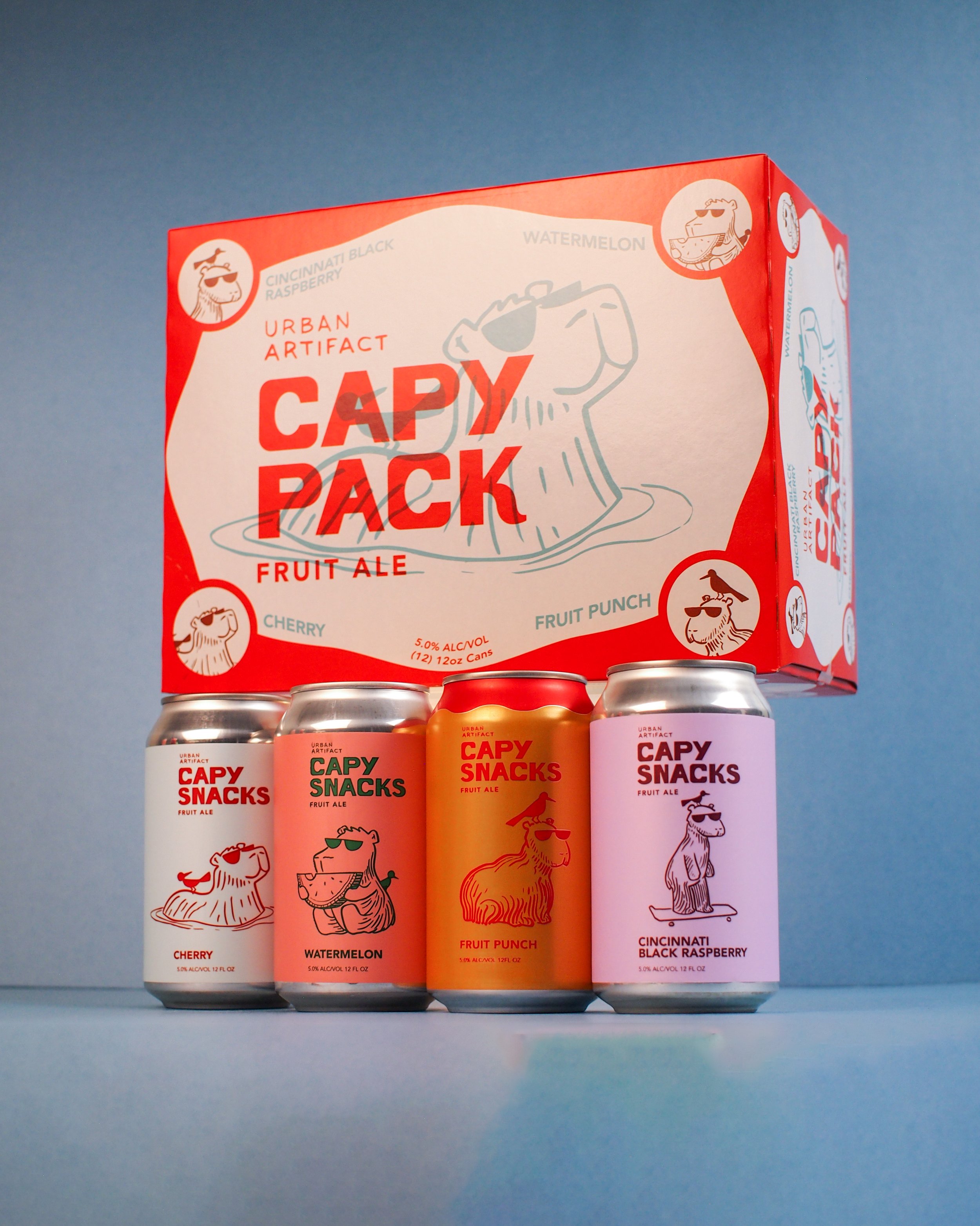
the largest fruit brewery in north america

Urban Artifact is the largest fruit brewery in North America - using exclusively real fruit and ingredients for their brews. I have been their Senior/Lead Graphic Designer for 5+ years.
I have helped craft, mold, and refine the brand messaging from labels, packaging, and digital assets for social media to merchandise and much more. This has been in collaboration with co-owner and excellent illustrator Scott Hand, whose creative character ideations, that we collaborate on, help drive the spirit of the brand.
When I first arrived at Urban Artifact they already had a stellar product that was undeniably unique, well-crafted, and tasty. One issue that I decided to tackle with co-owner, and creative director Scott Hand was: “How do we make this feel more hand-made and visually communicative of the voice of the brand?”
In the beginning the logo and most informational text on the product itself was a little clunky, and using up space that wasn’t necessary. I aimed to not only clean up unnecessary elements in most of the product and merchandise design, but also help guide and mold a more fitting visual approach to the logo and branding.
Where we landed was utilizing Scott Hand’s unique hand-made (no pun intended) style of drawing by not only redrawing the logo in his own penmanship, but also the titles of all of the Midwest Fruit Tart line. This has not only vastly improved the branding visually, but also has bridged a gap between the visuals and the spirit of the brand itself.