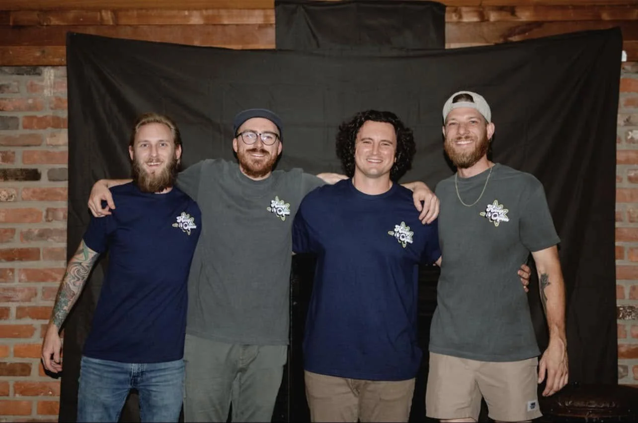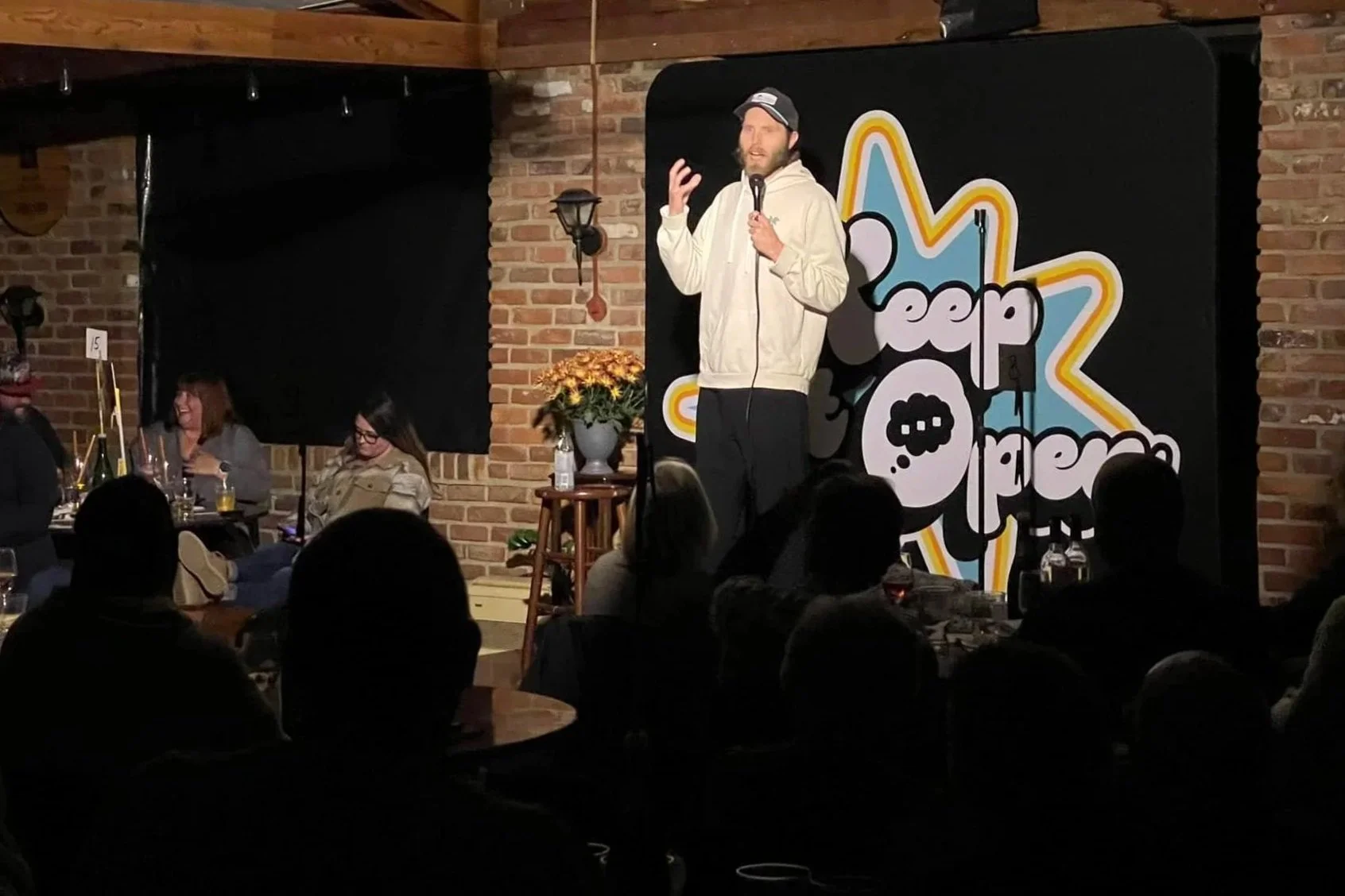
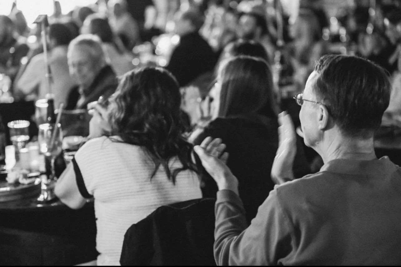
a premier open mic
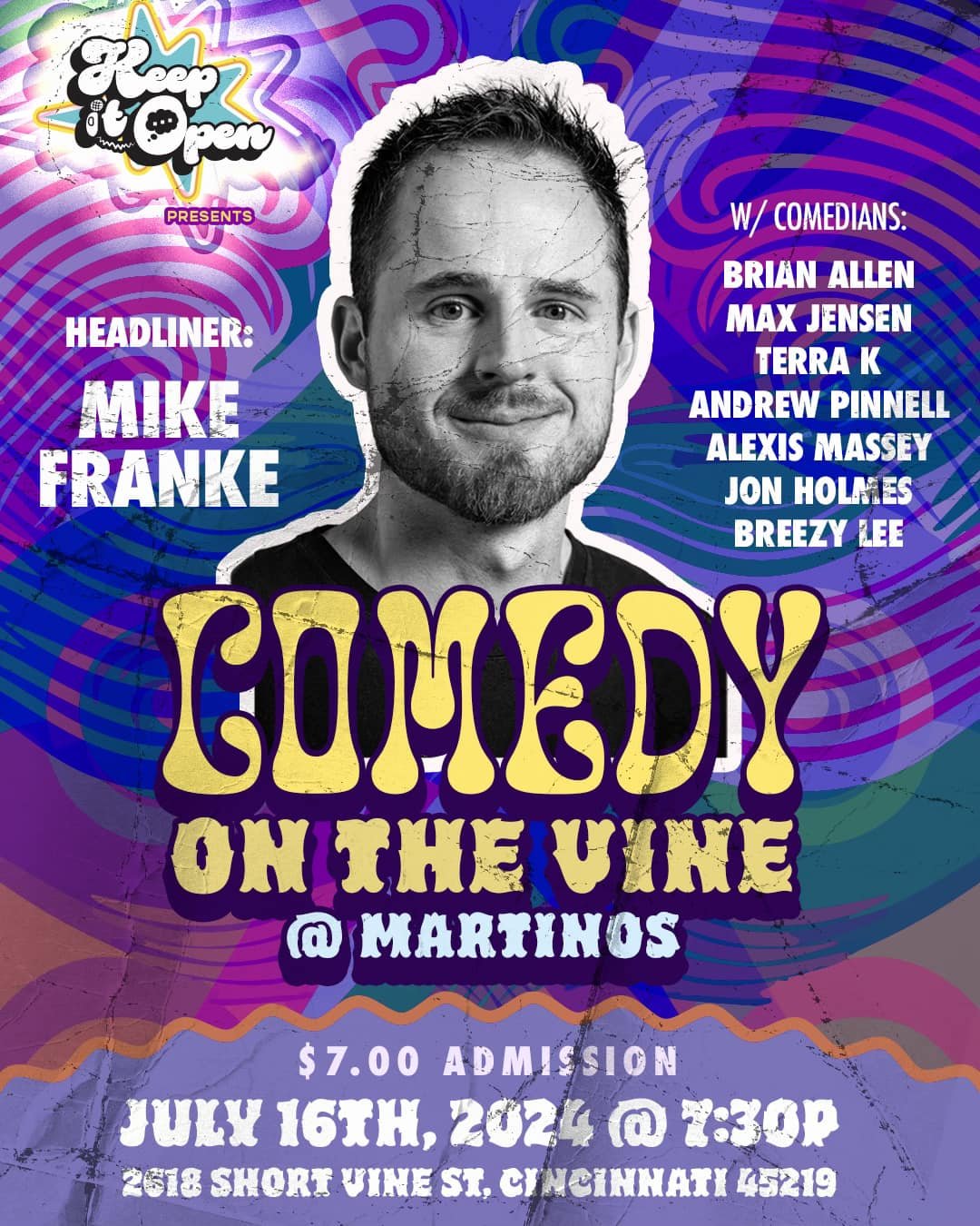
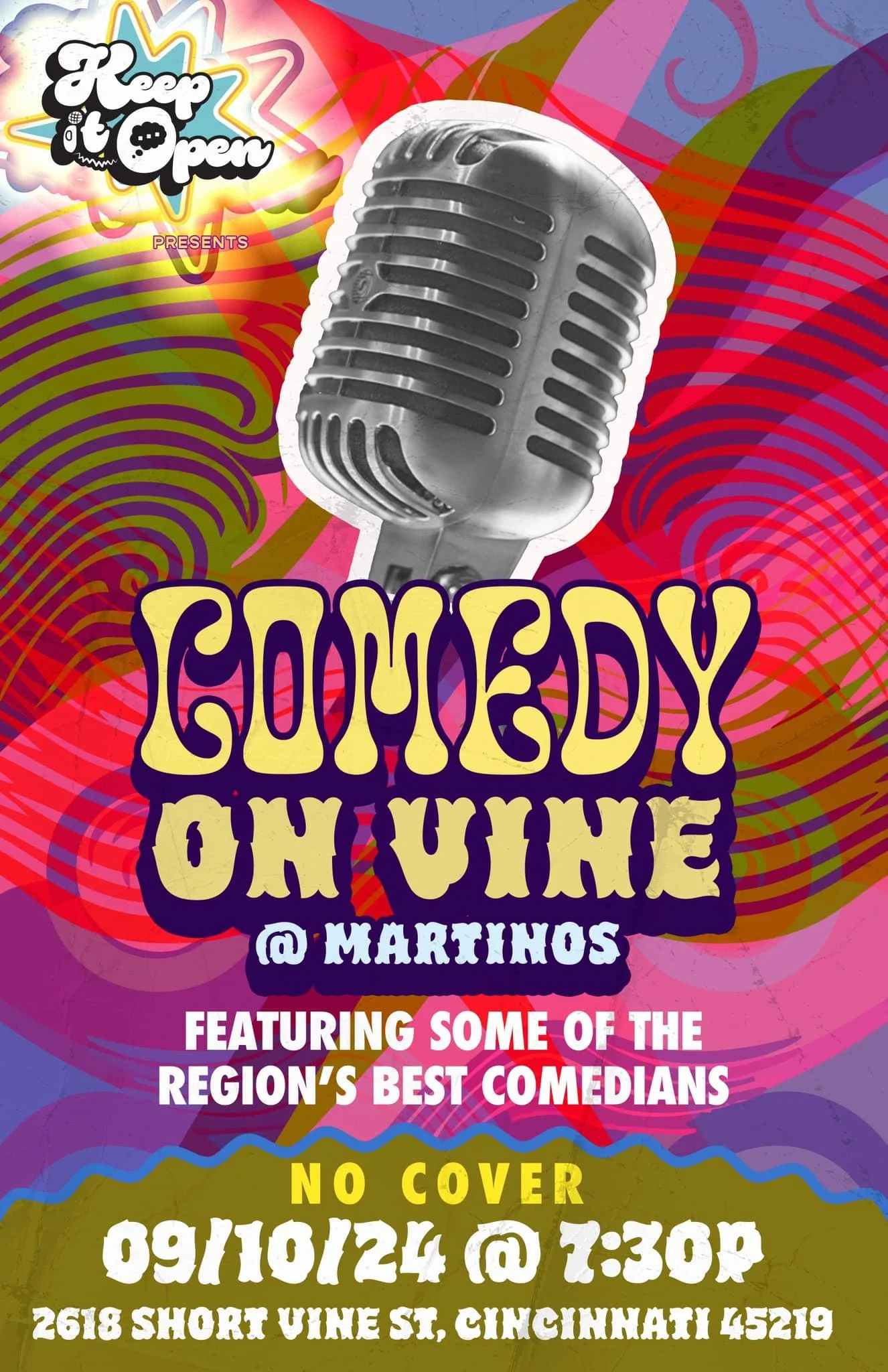
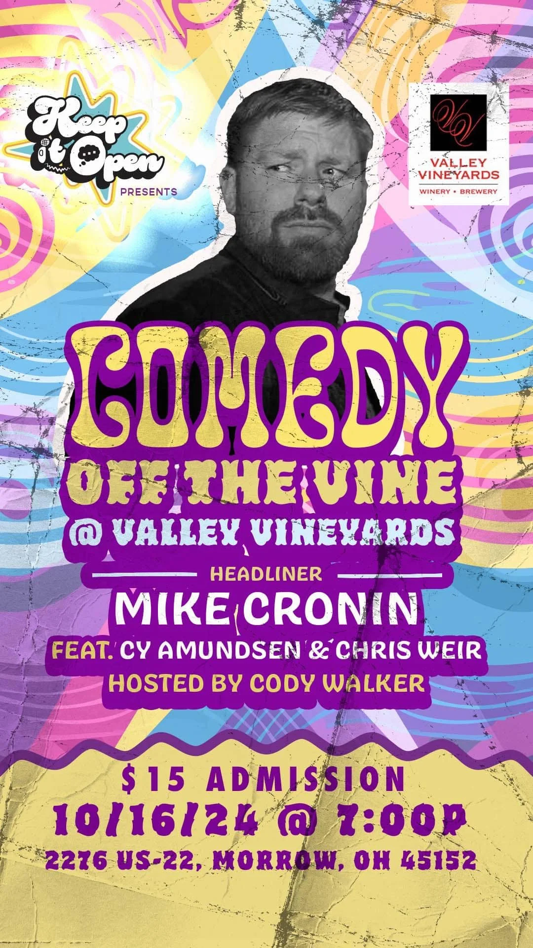
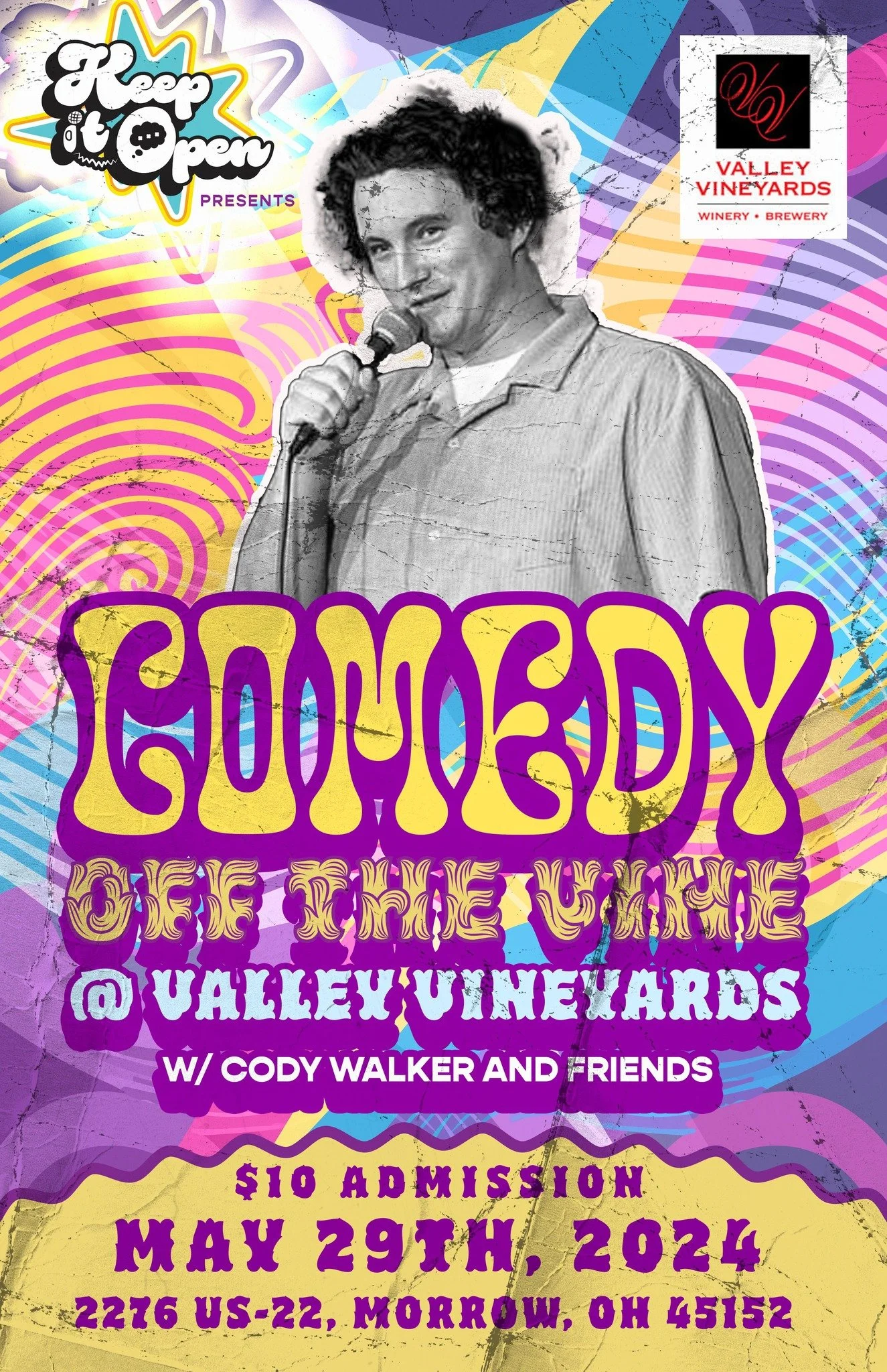
Keep It Open is an independent music and comedy shows throughout the greater Cincinnati area. The producers approached me with interest in designing a logo and some additional branding elements for their shows, just to give themselves a more solid professional visual element. With my background in comedy and music, I couldn’t resist! I began sketching ideas right away to figure out the perfect solution that would say to any eye: “this is where the talent performs”.
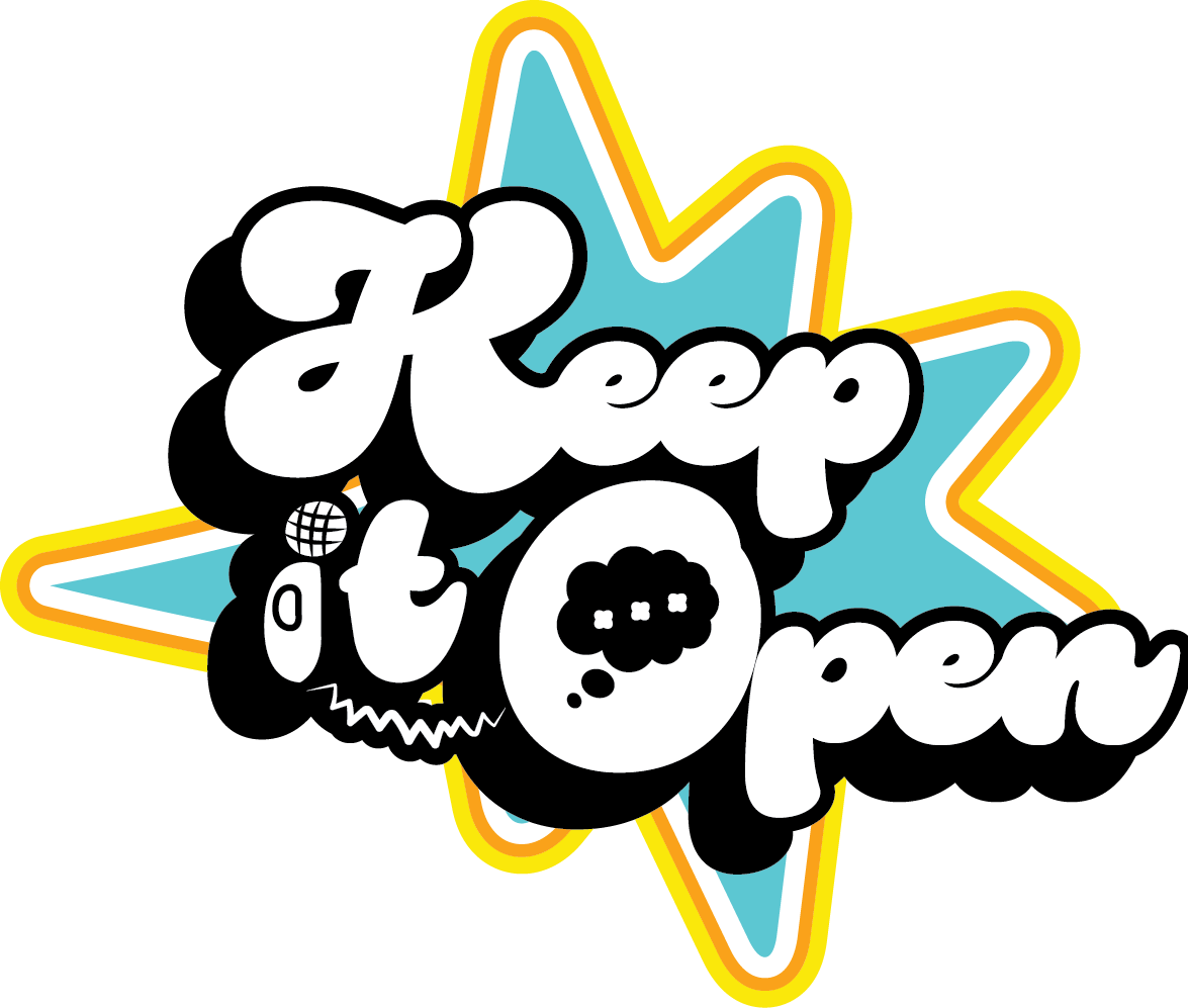
What MAKES AN ICON?
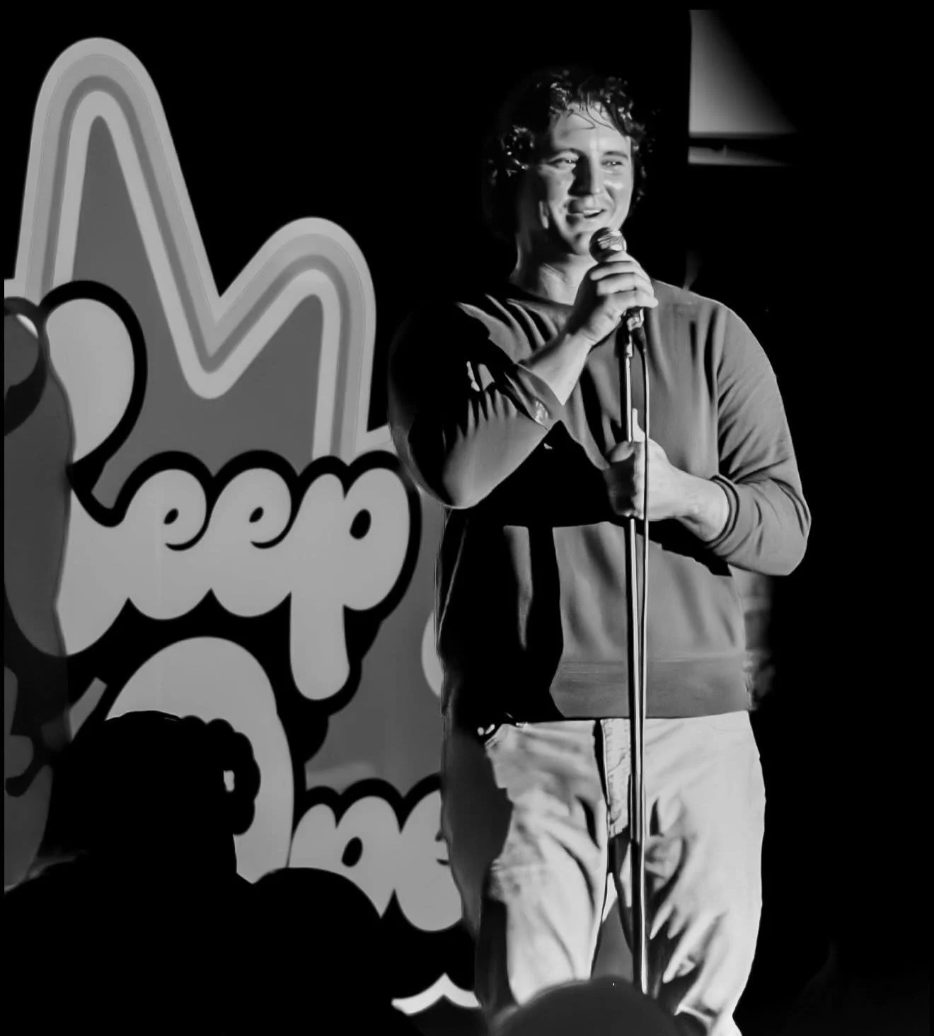
An open mic is a very ambiguous event, encompassing a range of performances such as music, comedy, poetry, and even magic. An important aspect of this project that I wanted to highlight in my final presentation was the creation of a logo that reflected what an open mic is: shiny, fun, and chaotic. I chose a retro atomic 70s aesthetic to effectively communicate the funky essence that generally characterizes open mic events.
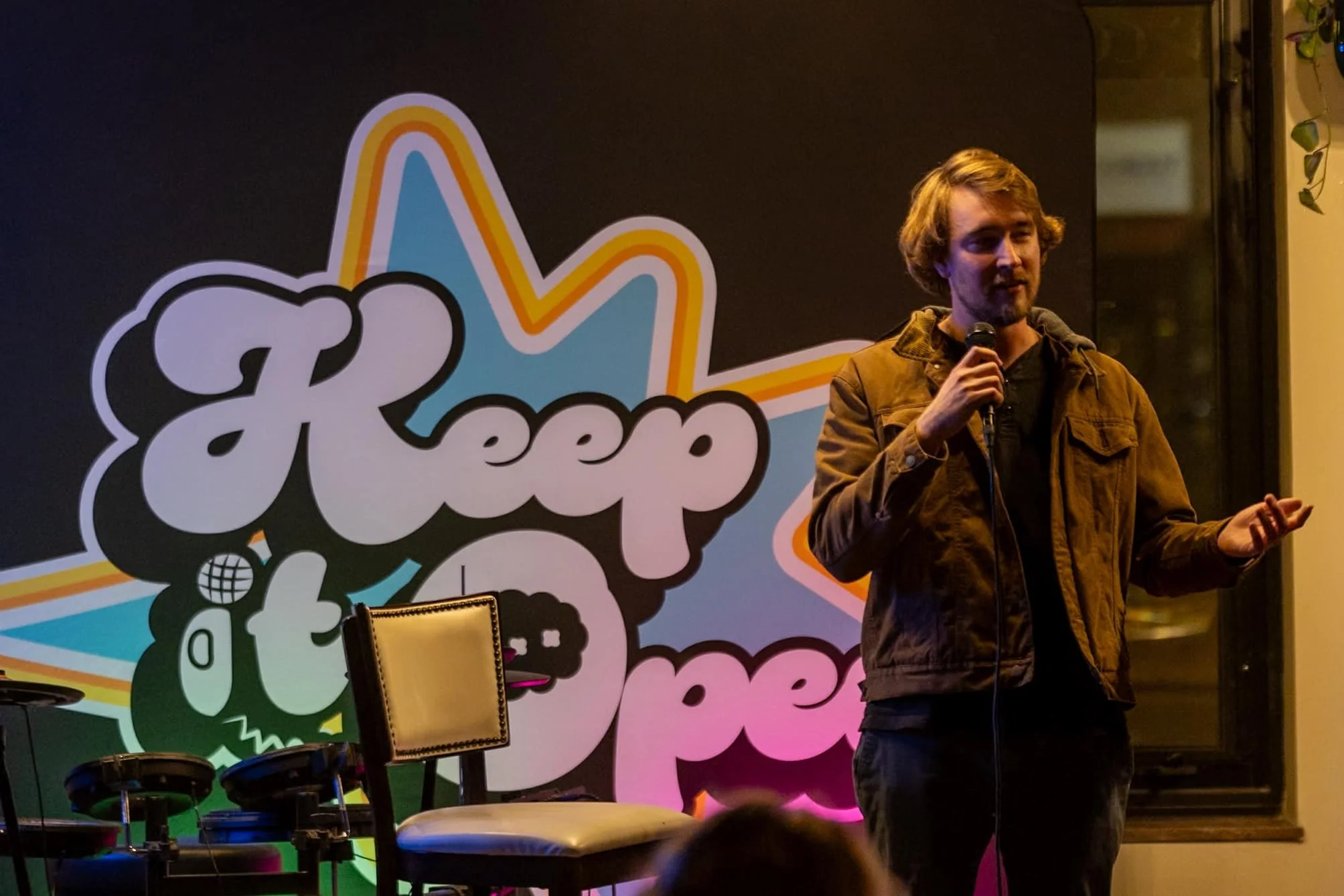
I aimed to use typography that was thick and flowing, reminiscent of a sign painter's style, to convey the amorphous nature of the talent that performs at such events.
Everything was coming together beautifully; however, there was still one key element to address: the client had requested that a microphone be incorporated into the logo. The solution came to me immediately: I could use the "i" in "it" to represent the microphone! Then I thought, “Why stop there?” I decided to design the "O" as a speaker, adding a speech bubble with ellipses to symbolize the infinite variety of what can be expressed at an open mic.