CRAFTING THE NICHE

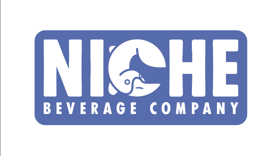
Niche Beverage is a packaging company in Cincinnati, OH with roots in brewing. Their goal is to help other businesses bring their unique drink ideas to life.
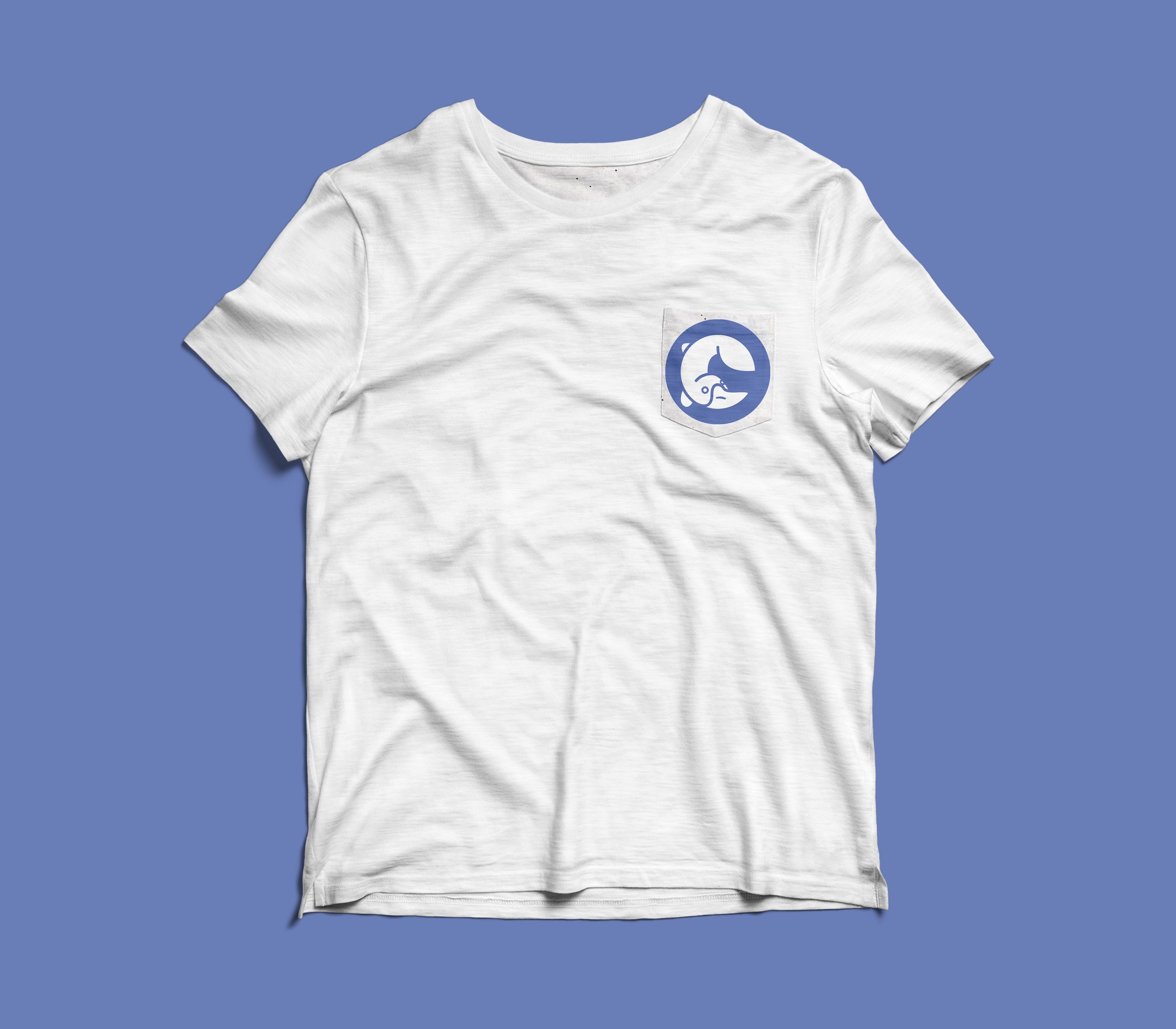
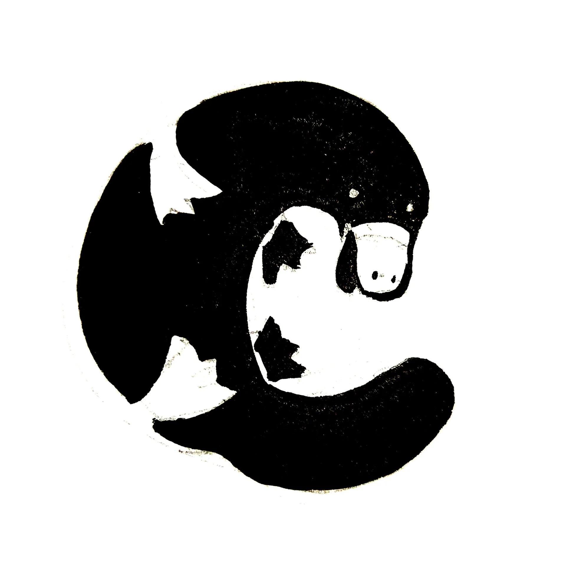
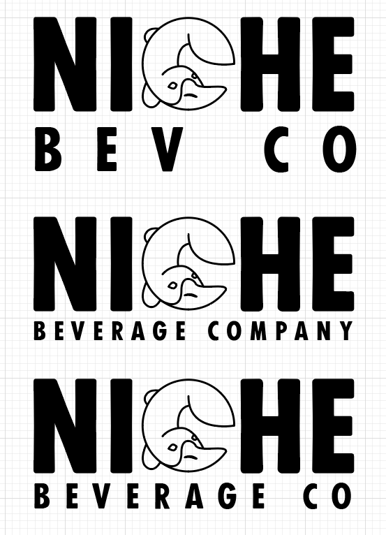
To start there was an initial idea of the brand mascot being a “platypus”, signifying the owners mixed bag of renaissance person experience. I used my minimizing techniques to bring a recognizable form to life that works not only as a stand alone icon, but as well as the C in the company title.
Evolving from nothing
This brand was a fun exercise in taking a rather obscure concept and running with it. With Niche BevCo’s mission to can the most adventurous products, it undoubtedly needed an equally adventurous logo. One that showcases its resilience and a huge swath of packaging abilities - so why not one of nature’s Swiss Army knife animals: the platypus!
It started as a simple sketch provided by the client and then evolved into a strong, yet playful, wordmark, where the platypus simultaneously forms the C of Niche but can also be detached as a solid Icon Mark.